In the last post I ended with a chart showing that while the healthy vaccinee effect appears to be artificially lowering death rates in the vaccinated, there was a trend suggesting that something odd was going on towards the lower end of the age range we were looking at (over 50’s).
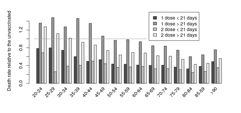
So, let’s continue that graph to include younger adults (data from the same source):
Remember, this is the death rate in vaccinated groups relative to the unvaccinated for all non-covid deaths; if the data are greater than one (indicated by the horizontal line on the chart) then it shows an increased risk of death compared with those remaining unvaccinated.
What we see is the trend continuing, to the point where the death rate is higher in the vaccinated groups than in the unvaccinated. This point of increased death rate is seen for those aged under 50 for the first dose, and those aged under 35 for the second dose.
So, is this the healthy vaccinee effect in reverse, caused by younger adults that are close to death being vaccinated? I don’t think that it is this simple — if you look at the above chart you should see that the death rate during the 21 days following each dose of vaccine remains below that of the unvaccinated; this suggests that those closest to death were still be spared the potential discomfort and risk of vaccination. I’d note that if those closest to death in younger age groups were being spared from vaccination, as the data suggests is the case for older adults, then the situation might well be even worse than suggested in the graph above.
Remember again that these are deaths not from covid; there definitely seems to be an indication that there might be a higher death rate in the vaccinated. These are extremely concerning data and indicate that urgent work needs to be carried out to identify whether this is a real effect; if the vaccines are indeed increasing the death rate in younger adults then we might well have brought tragedy upon ourselves.


My network wifi is TheVaccineKills. My neighbors in my building may not like it, but they can't say they weren't warned.
Excellent analysis - but I think you were a bit minimalist on describing your methods. The ONS report doesn't show 5 year age groups and plots out age-stratified results by month. I eventually found Table 9 in the spreadsheet in section six, and then verified that it was the source for your graph by running the math.
The report's suggestion that "prioritisation of the clinically vulnerable" accounts for this effect is not totally far-fetched. If there was a monthly breakdown of the 5 year age group deaths, that might help tease out what's going on.