Last November I published an article based on data from the UK’s Office of National Statistics (ONS) that discussed deaths by age and vaccination status. Well, they’ve provided an update to these data which allows a little more analysis — I’ll discuss these new data over the next few posts.
First, the healthy vaccinee effect.
In that previous post I showed data that indicated that they’d not vaccinated those close to death. This does make sense from a medical point of view — why impose discomfort and potentially increase the risks of the individual when they’ve got little time left to benefit from vaccine protection. However, this will have affected the statistics on the benefits of the vaccines in reducing mortality and so it is important to understand that it is happening.
Of course, the vaccines are supposed to reduce the death rate by affecting the impact of infection with covid on the body — so in order to see this effect we need to look only at deaths that aren’t from (with) covid. During this analysis it is important to remember that relatively few older individuals die suddenly — for the majority of deaths there is a time period where it is clear that the individual is very ill and doesn’t have long left.
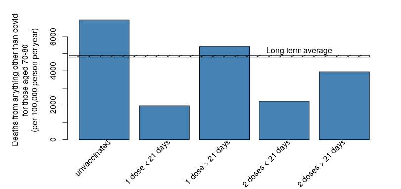
To illustrate this effect, the next graph shows the rate of deaths for everything other than covid for each vaccination period for those aged 70-79:
Several important aspects of the healthy vaccinee effect are readily visible in that chart — the death rate is lower after vaccination, is lowest in the 3 weeks after each vaccination and falls below the natural death rate after the second dose.
The data above has been only for those aged 70-80 — what does the data look like for other age groups? I’ll show data for those aged over 50 first (for those aged under 50 in the next post), but there is a complication — the death rate increases substantially with age, so in order to show a simple graph I’ll be showing first the relative death rates compared with that of the unvaccinated (the reference group), averaged over all age groups over 50:
There is definitely a lower death rate in the three weeks after each vaccination. Notably, this rate is far lower than the long term average death rate, and so there has to be a selection process going on, with those close to death (within 3 weeks) not being given a dose of vaccine.
The death rates immediately after the first and second dose are similar. This almost certainly reflects the ‘sudden deaths’ in this time period. Ie, if you exclude those where the onset of death is recognised then all that is left are those that die suddenly (whether through acute episodes such as heart attacks, or as a result of accident/incident).
The death rate is highest in the unvaccinated. This isn’t simply the normal death rate for that age group, as indicated by the horizontal line on the chart — the death rate is higher in the unvaccinated as it is a relatively small group that has had all those closer to death concentrated within it.
Even though the death rate is low within 21 days of the first vaccine dose it creeps above the normal death rate beyond those first three weeks. This is unlikely to be occurring in the 12 weeks between the first and second doses, but instead almost certainly reflects those closest to death (but considered strong enough to receive the first vaccine dose) being concentrated into the single vaccine dose cohort as the majority receive their second dose.
The death rate in those vaccinated with two doses of vaccine (after 21 days) falls below the natural death rate for that age group. While the line in the graph looks to simply be a ‘thick line’, it actually covers a range from natural deaths only (the lower edge of the line) to natural deaths, accidental deaths, murders and suicide (upper edge of the line); as the death rate in the age group shown can’t overall fall below the natural death rate this is very good evidence that the healthy vaccinee effect is taking place.
The healthy vaccinee effect isn’t simply a statistical nuance. If they didn’t vaccinate those close to death then all with covid hospitalisation and death statistics will be biased to show a positive effect of vaccine significantly greater than reality. The data I have shown in this post suggest that the only correct approach to understanding the effect of vaccination is via properly conducted cohort studies; simple analysis such as the Test-Negative Case-Control approach is very likely to overestimate vaccine effectiveness.
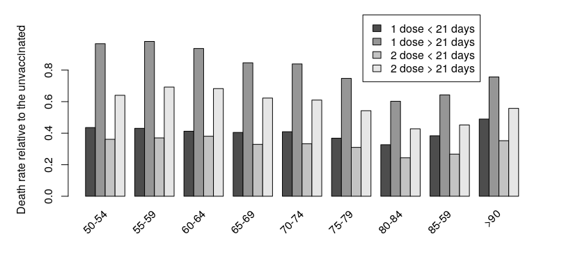
Of course, averaging across all age groups can hide all sorts of effects — the right question to ask at this point is how does the data differ by age? I’ve plotted the death rate relative to the unvaccinated by age group for those aged over 50 in the following graph:
Hmm. There appears to be an effect of age — the relative ‘improvement’ (or, the magnitude of the healthy vaccinee effect) is greatest for those aged in their 80’s, and there’s a definite reduction in the effect for lower age groups. I’ll look into this in my next post.


