I was watching a video by John Campbell on Youtube the other day. He’s quite entertaining to watch — he’s been very supportive of the official response, but over the months there’s been a gradual realisation that he’s been duped over many aspects of the covid narrative — I’m waiting for the point where he realises that the vaccines haven’t been the saviour that he believes.
About halfway through this video he presented a graph from the UK Office for National Statistics on deaths in the UK from (with) covid vs influenza:
That graph immediately struck me as being rather misleading. There’s a strong suggestion that the sudden drop in influenza deaths at around the year 2000 was due to the introduction of the ‘flu vaccine to the population. This isn’t the case — what happened is that in 1999/2000 there was a change from using the ICD-9 definition of ‘death from influenza and pneumonia’ to the ICD-10 definition. This was associated with a significant reduction of attributed deaths. This effect was described in a paper on pneumonia and influenza deaths in England and Wales by Mann et al in 2013:
With the change from ICD 9 to ICD 10 in 2000, deaths coded to underlying respiratory disease fell by approximately 22%, and deaths coded specifically to underlying pneumonia fell by 38%.
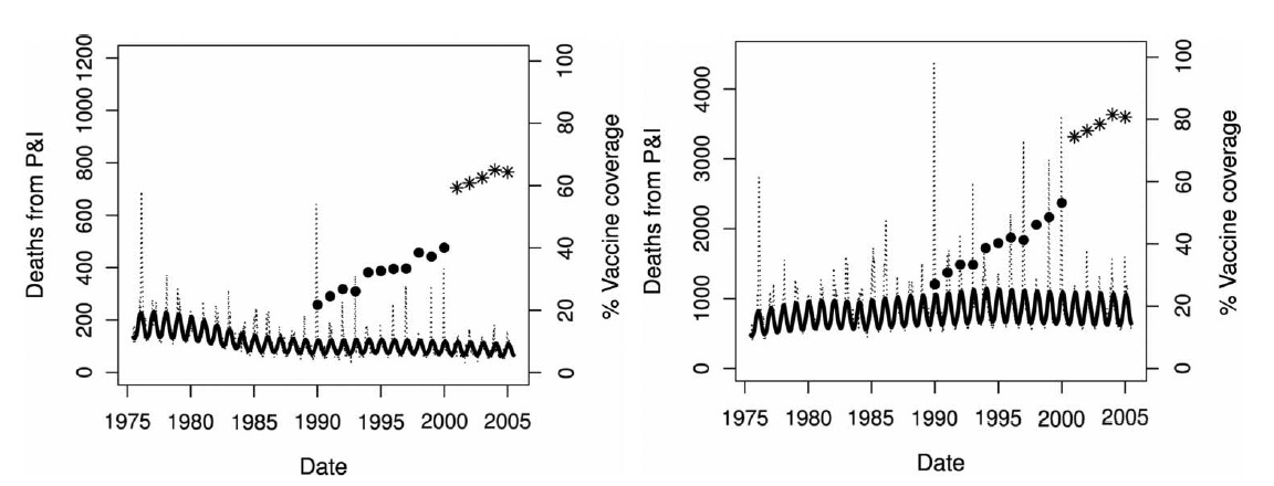
That same paper also showed the deaths per year over the period from 1975 to 2006 using a consistent definition of ‘death’:
Deaths and proportion vaccinated against influenza from 1975 to 2006, for those aged 65-74 (graph on the left) and for those aged over 75 (right).
That wiggly line towards the bottom of each graph is the number of deaths per week — you can see in the fine detail the seasonal changes in deaths from pneumonia and influenza but no sudden change around the year 2000 as they brought in the offer of the ‘flu vaccine for everyone over the age of 65.
The ‘circles and stars’ on the graph above indicate the proportion of the population over the age of 65 that were vaccinated against influenza — this shows it to be a slow process of increasing vaccination levels, rather than the instantaneous change in 2000 suggested by the ONS graph.
It might be considered surprising that the national data doesn’t show a significant reduction in deaths from pneumonia/influenza over the period from 1990 to 2005, given the increase in vaccination levels and given that so many studies have shown that they’re protective at an individual level — but such is the nature of reality vs theory.
The graph from the ONS could have been better presented with an additional shaded area from the year 2000 to indicate that the definitions had changed, just as they’d done for the period from 1984 to 1993 — but that wouldn’t have suggested that the ‘flu vaccine is what led to the dramatic reduction.
However, the graph actually exists to indicate how much worse covid was than influenza — in which case it would probably have been better to have offered the influenza and pneumonia death rates using a consistent definition. I’ve given it a go, just by shifting the graph sections using Photoshop (this is merely for illustrative purposes — I’ve not done this properly using source data):
That now tells an entirely different story:
The flu vaccines don’t lead to a massive drop in influenza and pneumonia mortality. There is a small decline in deaths between 2000 and 2020 that is possibly explained by the mass vaccination.
Deaths due to covid now appear only slightly higher than the expected deaths due to influenza and pneumonia.
There’s a suggestion that there was slight drop in influenza and pneumonia deaths in 2020 and 2021 — it looks like these deaths were simply translated into covid deaths.
It is important to note that these influenza/pneumonia deaths and covid deaths are additive — there really were more deaths during this period. The point is simply that covid became a new disease that looks to be of similar (slightly higher) risk to influenza/pneumonia, as opposed to the suggestion in the original graph that covid was far more lethal than influenza/pneumonia.
One last point — how do we know that the covid deaths had the same ‘definition’ of the causative agent as the influenza and pneumonia deaths? We don’t. That said, while it is possible that influenza/pneumonia deaths were actually higher than indicated in the graphs above, the tendency to define every death within 28 days of a positive test for covid would suggest that it is the covid deaths in the graphs above that are overstating mortality risk.


This relentless push by the medical mafia to deify vaccines has achieved the exact opposite as I now despise the evil little pricks - every last vaccine. And I don't think I am alone.
If I was to make a guess about their intentions, it was to create a graph that purports to show us damn unvaxxed, just how efficacious the flu jab was and so "how dare we question the current "experts".